a brief for @clubdillydally
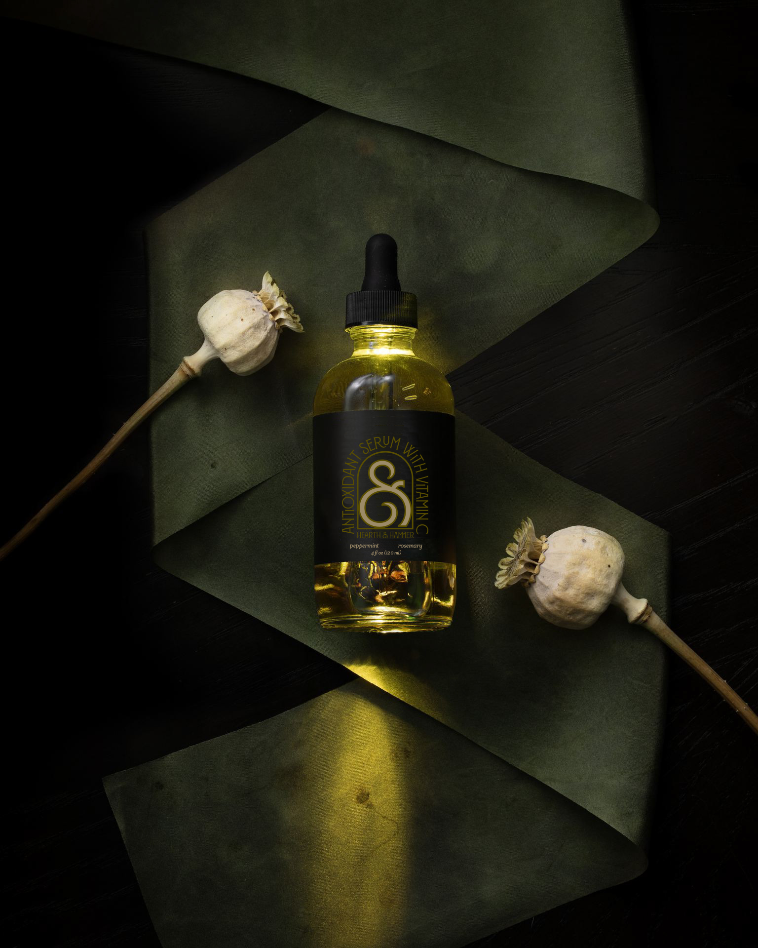
deliverables include a full logo suite, social and wesbsite templates, and product mockups
HEARTH & HAMMER
Behind the Curtain
Hearth & Hammer was an interesting design concept because I leaned more into the mysterious and moody side of ancient alchemy instead of modern apothecary. I was inspired by the photography of Drew Johanna and Nick Night and decided to base my color branding and mockups on their moody apothecary still-life series.
I love the way the deep chartreuse and forest green pair nicely with the logo and product designs. I used an arch for the brand mark, which came from the concept of an alchemical fireplace representing the hearth of a home. I also used the ampersand as a secondary brand mark, sometimes in the shape of an arch, to tie in.
I learned a lot about alchemy healing while doing research for copy and product examples of what this company would sell, and I feel as if I captured the aura beautifully between the ligatures in the typography and the selection of photography used in the mockups.


